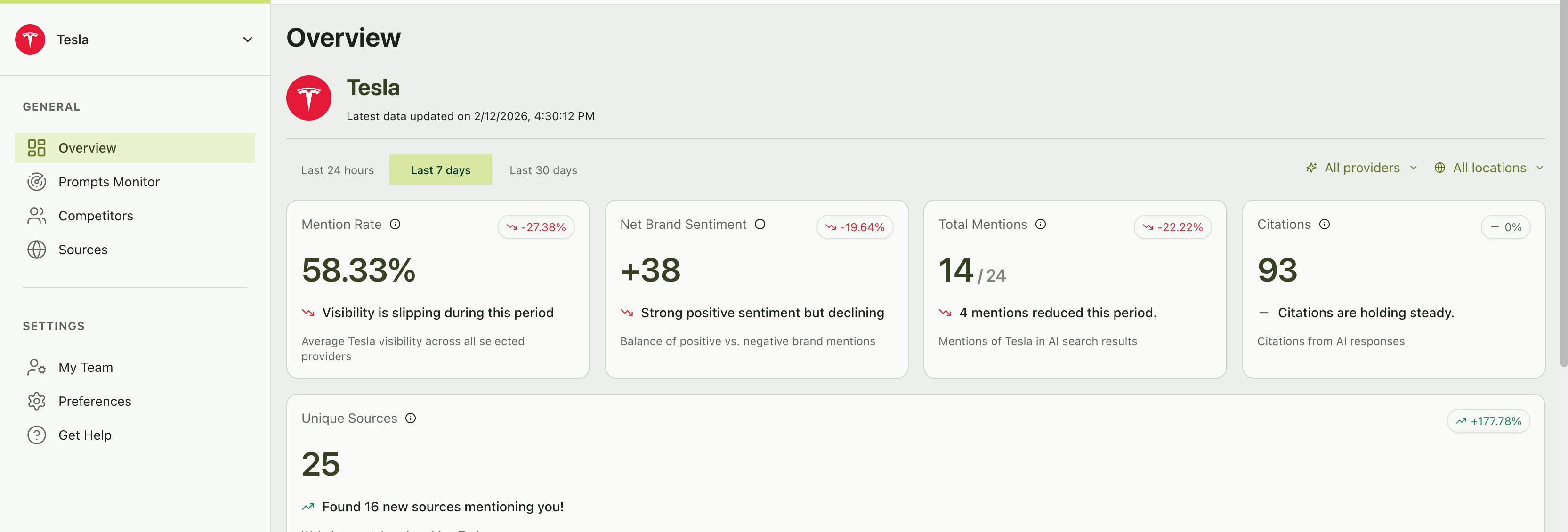
The Overview header
At the top of the Overview page, you’ll see your brand name and logo for the currently selected brand, along with the latest data timestamp showing when the most recent prompt run completed. Below that, filters let you control the data scope:- Time range — Last 24 hours, Last 7 days, Last 30 days
- Provider filter — All providers, or a specific one (ChatGPT, Perplexity, AI Overview)
- Location filter — All locations, or a specific market
Key metric cards
Five metric cards span the top of the dashboard. Each shows a current value, a change indicator (vs. the previous period), and a brief AI-generated insight.Mention rate
Mention rate
What it measures: The percentage of AI responses that mention your brand across all monitored prompts and providers.How to read it:
- 58.33% means your brand appeared in roughly 58% of all AI responses
- Change indicator (e.g., “-27.38%”) shows how this compares to the previous equivalent period
- A declining mention rate means AI assistants are mentioning your brand less frequently
Net brand sentiment
Net brand sentiment
What it measures: The balance of positive versus negative sentiment across all mentions. Expressed as a number (e.g., “+38”).How to read it:
- Positive numbers (e.g., “+38”) indicate more positive than negative mentions
- Negative numbers indicate the opposite
- The change indicator shows whether sentiment is trending up or down
Total mentions
Total mentions
What it measures: The raw count of AI responses that mentioned your brand, shown as a fraction of total responses (e.g., “14 / 24”).How to read it:
- 14 / 24 means your brand was mentioned in 14 out of 24 total responses
- The change indicator shows whether you’re being mentioned more or less than before
Citations
Citations
What it measures: The total number of source citations across all AI responses that mentioned your brand.How to read it:
- A high citation count means AI providers are referencing many sources when discussing your brand
- Stable or growing citations suggest consistent source coverage
Unique sources
Unique sources
What it measures: The number of distinct websites and domains that appeared as citations alongside your brand.How to read it:
- A growing number of unique sources means more websites are being associated with your brand in AI results
- The change indicator can be dramatic (e.g., “+177.78%”) as new sources are discovered
Visibility score chart
The Visibility Score chart is a time-series line graph that tracks your brand’s visibility percentage over time, plotted alongside all your tracked competitors. How to read it:- The Y-axis shows visibility score from 0% to 100%
- The X-axis shows dates within your selected time range
- Each line represents a brand — yours plus your competitors
- Higher is better — a visibility score of 75% means that brand appeared in 75% of AI responses on that day
- Your line trending upward — Your AI presence is growing
- Your line trending downward — Check which prompts lost mentions
- A competitor’s line crossing above yours — Dig into which prompts they’re winning
- Convergence — All brands moving toward similar scores may indicate prompt saturation
Visibility score vs. mention rate — These are similar but not identical. Mention Rate is your aggregate percentage across the entire period. Visibility Score is plotted per day, showing the daily fluctuation. The chart helps you see when changes happened, while the metric card shows the overall picture.
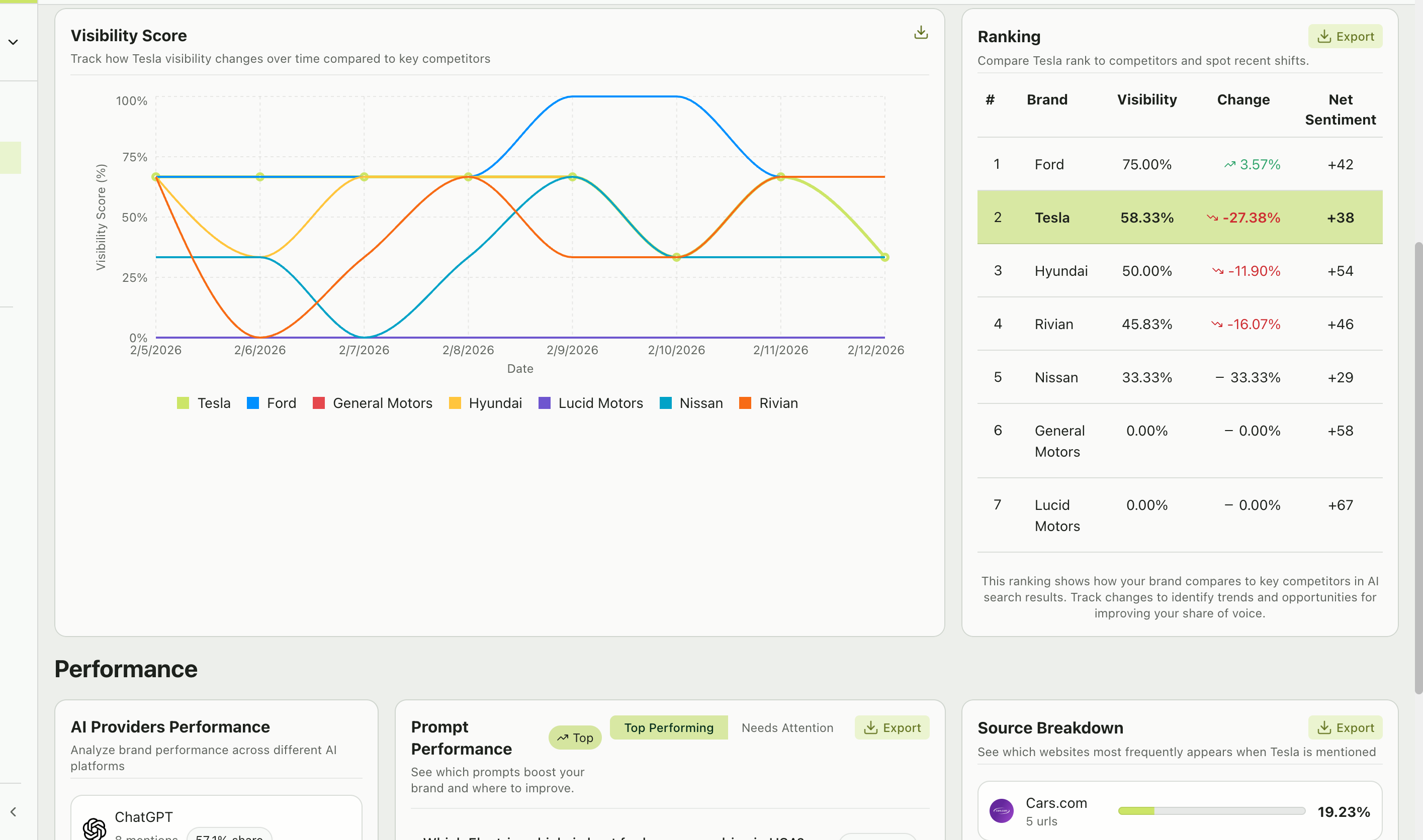
Ranking table
The Ranking table provides a competitive leaderboard — see exactly where your brand stands:| Column | Description |
|---|---|
| # | Position in the ranking (1 = most visible) |
| Brand | Brand name |
| Visibility | Mention rate for this brand |
| Change | Percentage point change from the previous period |
| Net sentiment | Overall sentiment score for this brand |
- Your position — Are you #1? If not, who’s above you and why?
- Change column — Positive change means a brand is gaining ground; negative means they’re losing it
- Sentiment gaps — A competitor with higher visibility but lower sentiment may be vulnerable
Performance section
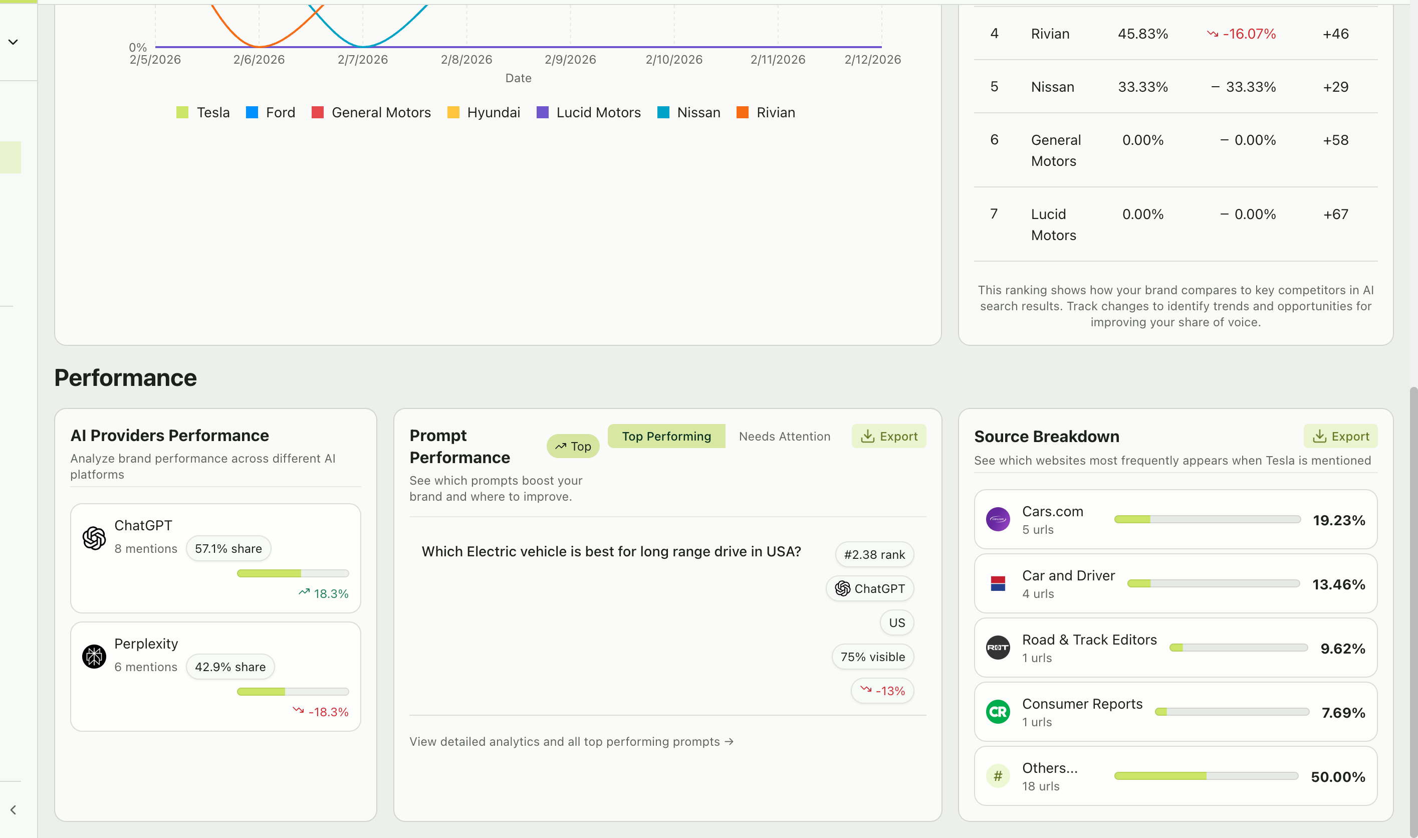
AI providers performance
This section breaks down your brand’s performance by AI platform. For each provider, you’ll see:- Mention count — How many responses from this provider mentioned your brand
- Share percentage — What portion of your total mentions comes from this provider
- Change indicator — Whether this provider’s share is growing or shrinking
Prompt performance
Two views let you quickly assess your prompt portfolio:- Top performing
- Needs attention
Prompts where your brand has strong mention rates and high rankings. These are your wins — understand what makes these prompts work.
- The prompt text (clickable to view full details)
- Average rank
- Top provider
- Location
- Visibility percentage and change
Source breakdown
A bar chart showing which websites appear most frequently when your brand is mentioned. For each source domain, you’ll see:- Domain name and favicon
- Number of URLs from that domain
- Percentage share of total citations
- Which publications and websites drive the most AI citations in your space
- Whether your own website appears (and if not, that’s a content gap to address)
- New sources appearing that weren’t there before
Smart insights carousel
On the Prompts Monitor page, you’ll notice a Smart Insights carousel at the top. These are AI-generated observations about your performance, such as:“We detected 1 prompt(s) where your brand struggles to appear. It was mentioned in fewer than 30% of answers.”These insights are designed to quickly surface the most important things to pay attention to. Use the arrows to cycle through available insights.
Exporting your data
Multiple sections across the dashboard include Export buttons. You can export:- Ranking tables — Download competitive rankings as CSV
- Prompt performance — Export your prompt analytics
- Source data — Download citation and source information